Brand Identity and Campaign Design
JUST Gender-Inclusive Period Products
Brief
Create a brand identity, packaging, and campaign for a range of gender-inclusive period products that make transgender and gender-nonconforming people feel more represented and comfortable when purchasing and using these products.
Response
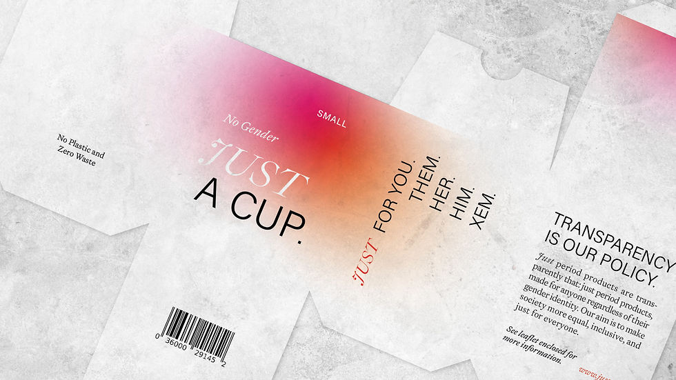
JUST aims to create a just society that is period proud and inclusive of all gender identities and expressions. To reflect this, I created an identity, packaging and campaign collateral that was unapologetically queer and facilitated an open discourse surrounding menstruation.
I explored the liminal space between binary states – using type that is both ornamental and utilitarian and colours that bleed together to create new hues between the standard cyan, magenta and yellow. Combined with photography that proudly and authentically captured queer bodies, this formed an identity that aimed to represent and empower the queer community.
To make a statement on the stigma surrounding period products, I designed transparent packaging so that tampons, pads and menstrual cups could be displayed publicly on supermarket shelves. The simple, utilitarian design challenged the notion that they are shameful and gendered. This theme of transparency wove through the campaign, dictating the placement of advertising on shop windows, and the direct, non-euphemistic language used.